
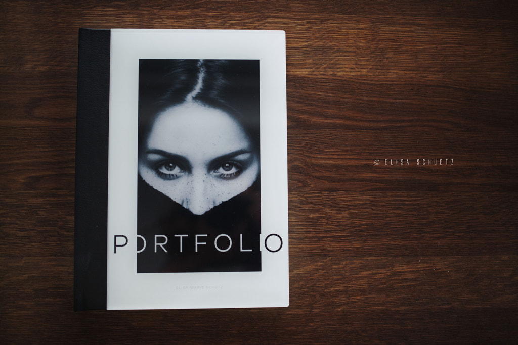
wer mir noch aus alten Tagen auf Instagram folgt, hat es schon gesehen: Mein neues Editorial Portfolio von Saal Digital! Schon vor etwa zwei Jahren durfte ich als Produkttesterin eines ihrer Fotobücher designen und habe damit meine People Series gestaltet - klick. Dieses Mal durfte ich die Professional Line testen & ich sag euch, mit diesem Titel wird einem nicht zu viel versprochen.
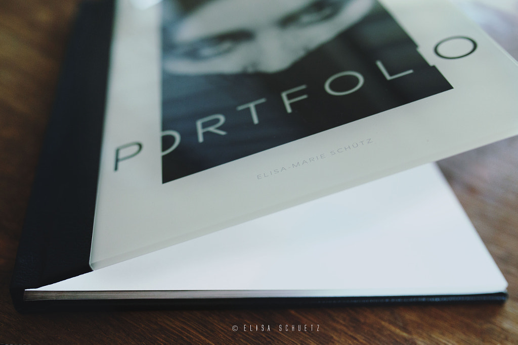
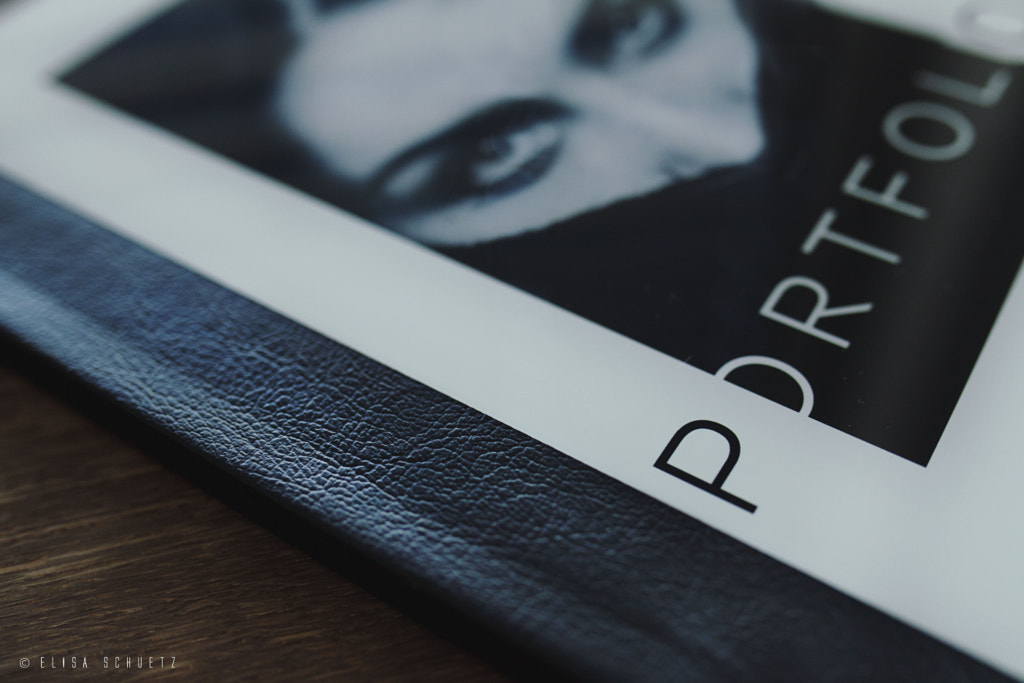
Für das Cover habe ich mich für eine Acryl Platte mit Ledereinband entschieden. Auch wenn ich zugegebener Maßen anfangs ein wenig skeptisch war, kann ich euch sagen, es wirkt echt hochwertig und macht einen tollen Eindruck. Wieso aber skeptisch? Viele Fotos, die mit Plexiglas oder Acryl versehen sind, können auch schnell billig und verfälscht wirken. Gerade verschiedene Lichtsituationen sind eine Herausforderung. Insofern war ich auf das Resultat sehr gespannt & wurde wie gesagt nicht enttäuscht.
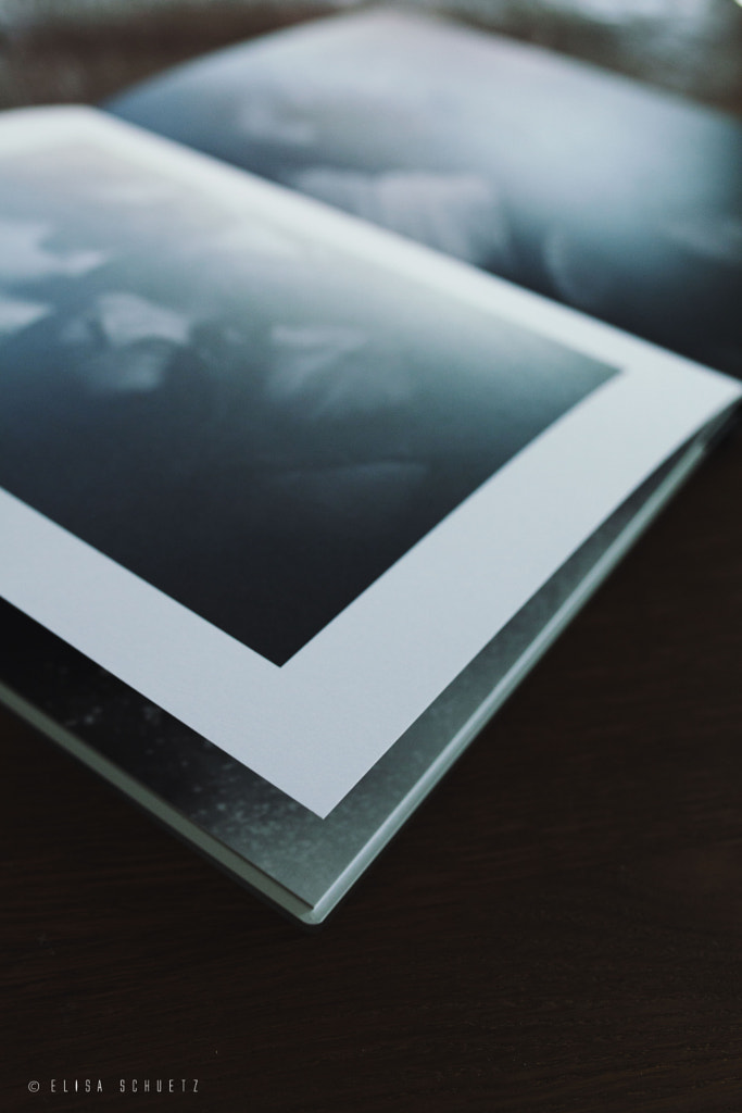
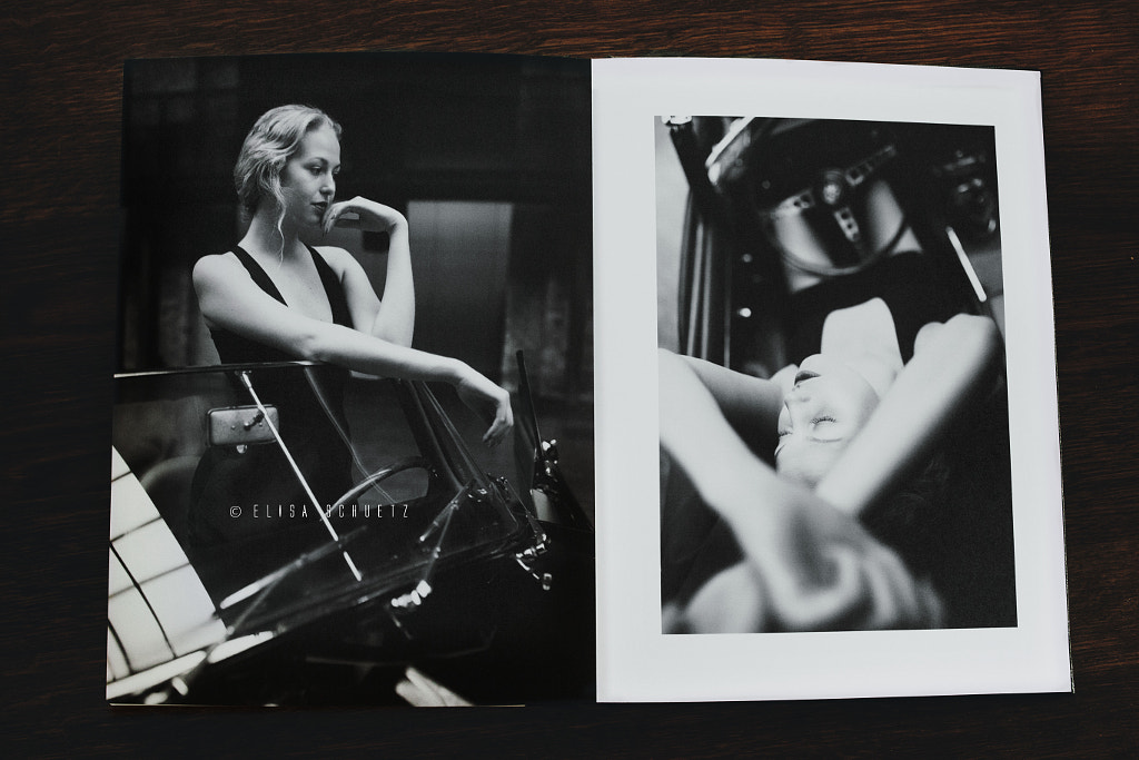
Ebenso habe ich mich für mattes Fotopapier entschieden, da Fingerabdrücke bei glänzendem Papier immer nicht zu unterschätzen sind. Doch egal welches Papier es bei euch wird; es übertrifft nichts, das erste Mal durch seine gedruckten Fotos zu blättern, gerade bei dieser Papierstärke!
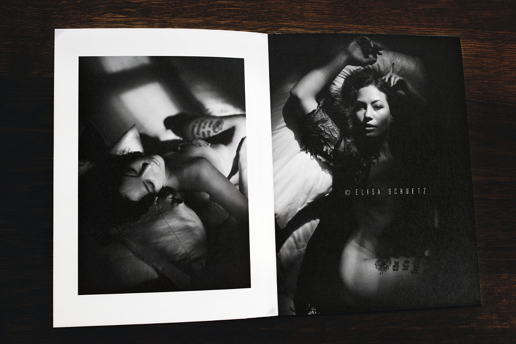
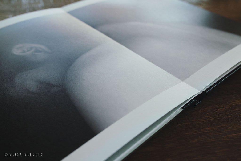
Durch die Flat Lay Technik von Saal Digital ist es ebenso problemlos möglich, Fotos über beide Seiten zu drucken, ohne, dass wichtige Bilddetails in der Falz verschwinden. Der schwarze Ledereinband gibt dem Buch den letzten Schliff und passt finde ich sehr gut zu meinem gewünschten Look.
Some of you might have already seen my new phonebook on Instagram. I had the chance to collaborate another time with Saal Digital, my number one print service. Two years ago, I was lucky to test the normal Phonebook line - click! Back then, I designed the book with a few photos from my people series - and it was already gorgeous! This time I was asked to test the Professional Line - and I can tell you, they're keeping their promises with the name!
I decided for an acrylic cover, even tough I was not quite convinced at first. Why? In the past, I often came along bad quality with acryl or glas printings. Either way, it changed the colors with differing light or it looked cheap. In this case however, I can assure you: it blew me away & it is definitely high quality! Furthermore, I decided to go for a matte paper finish - simply because I am no fan of a personal signature by every viewer through their fingertips. However, no matter what paper you go for: there is no such thing, as going through the pages of your book for the first time! The paper weight is nice and firm, just like a real book - it is just amazing!
As well, one big advantage of Saal Digital is their Flat Lay technique. Remember the time, when you had been afraid to print photos over both sides, because the middle part of the photo could vanish in the seam of the book? Not anymore! With Flat Lay, these troubles are long gone.
Last but not least, I love the black leather coating - it just supports the look I imagined for the book so well.
Für das Cover habe ich mich für eine Acryl Platte mit Ledereinband entschieden. Auch wenn ich zugegebener Maßen anfangs ein wenig skeptisch war, kann ich euch sagen, es wirkt echt hochwertig und macht einen tollen Eindruck. Wieso aber skeptisch? Viele Fotos, die mit Plexiglas oder Acryl versehen sind, können auch schnell billig und verfälscht wirken. Gerade verschiedene Lichtsituationen sind eine Herausforderung. Insofern war ich auf das Resultat sehr gespannt & wurde wie gesagt nicht enttäuscht.
Ebenso habe ich mich für mattes Fotopapier entschieden, da Fingerabdrücke bei glänzendem Papier immer nicht zu unterschätzen sind. Doch egal welches Papier es bei euch wird; es übertrifft nichts, das erste Mal durch seine gedruckten Fotos zu blättern, gerade bei dieser Papierstärke!
Durch die Flat Lay Technik von Saal Digital ist es ebenso problemlos möglich, Fotos über beide Seiten zu drucken, ohne, dass wichtige Bilddetails in der Falz verschwinden. Der schwarze Ledereinband gibt dem Buch den letzten Schliff und passt finde ich sehr gut zu meinem gewünschten Look.
Hi guys!
Some of you might have already seen my new phonebook on Instagram. I had the chance to collaborate another time with Saal Digital, my number one print service. Two years ago, I was lucky to test the normal Phonebook line - click! Back then, I designed the book with a few photos from my people series - and it was already gorgeous! This time I was asked to test the Professional Line - and I can tell you, they're keeping their promises with the name!
I decided for an acrylic cover, even tough I was not quite convinced at first. Why? In the past, I often came along bad quality with acryl or glas printings. Either way, it changed the colors with differing light or it looked cheap. In this case however, I can assure you: it blew me away & it is definitely high quality! Furthermore, I decided to go for a matte paper finish - simply because I am no fan of a personal signature by every viewer through their fingertips. However, no matter what paper you go for: there is no such thing, as going through the pages of your book for the first time! The paper weight is nice and firm, just like a real book - it is just amazing!
As well, one big advantage of Saal Digital is their Flat Lay technique. Remember the time, when you had been afraid to print photos over both sides, because the middle part of the photo could vanish in the seam of the book? Not anymore! With Flat Lay, these troubles are long gone.
Last but not least, I love the black leather coating - it just supports the look I imagined for the book so well.
Y O U R S, E L I S A.
♥♥♥